Pharmacy Customer Onboarding Experience
Art Direction / Customer-facing Web App (2012)
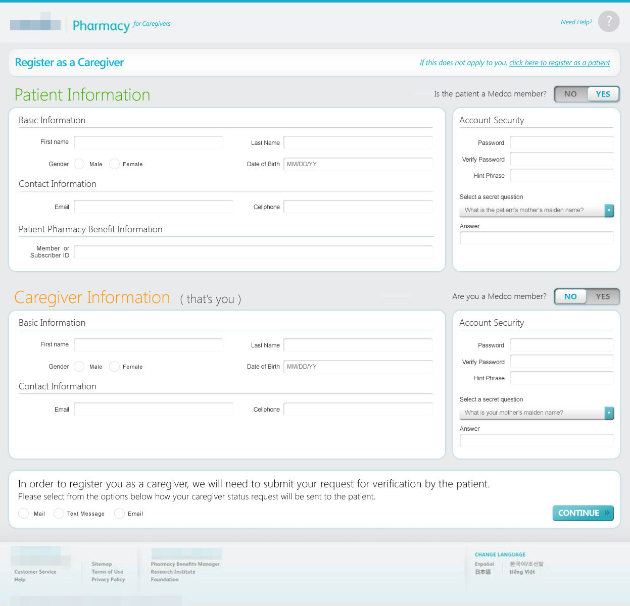
As a part of developing a digital transformation consulting engagement for a pharmaceutical benefit management provider, Bond Strategy and Influence developed a series of high fidelity concept visuals for a future online customer onboarding experience for patients and caregivers. I served as the art director and visual design responsible for bringing these concept illustrations to life.

TOPIC LANDING PAGE

CHAPTER DETAIL

CHAPTER DETAIL
Reflection
Here we begin to see UI conventions that start to resemble what we see today. This all, a result of the release of the iPad in 2012, and web designers becoming inspired by what's happening in the mobile space.
These were quickly put together to demonstrate a concept of an onboarding experience, so much of the user experience here doesn't make a lot of sense. Beyond that, there are some consistency issues with the UI elements here as well, with text boxes notably resembling legacy web UI while buttons and drop down controls reflecting more touch based styling. Form text here could also use alignment with the overall aesthetic.
These were quickly put together to demonstrate a concept of an onboarding experience, so much of the user experience here doesn't make a lot of sense. Beyond that, there are some consistency issues with the UI elements here as well, with text boxes notably resembling legacy web UI while buttons and drop down controls reflecting more touch based styling. Form text here could also use alignment with the overall aesthetic.
Learn more about me.

