Training Center for American Express OPEN Forum
Art Direction / Microsite (2010)
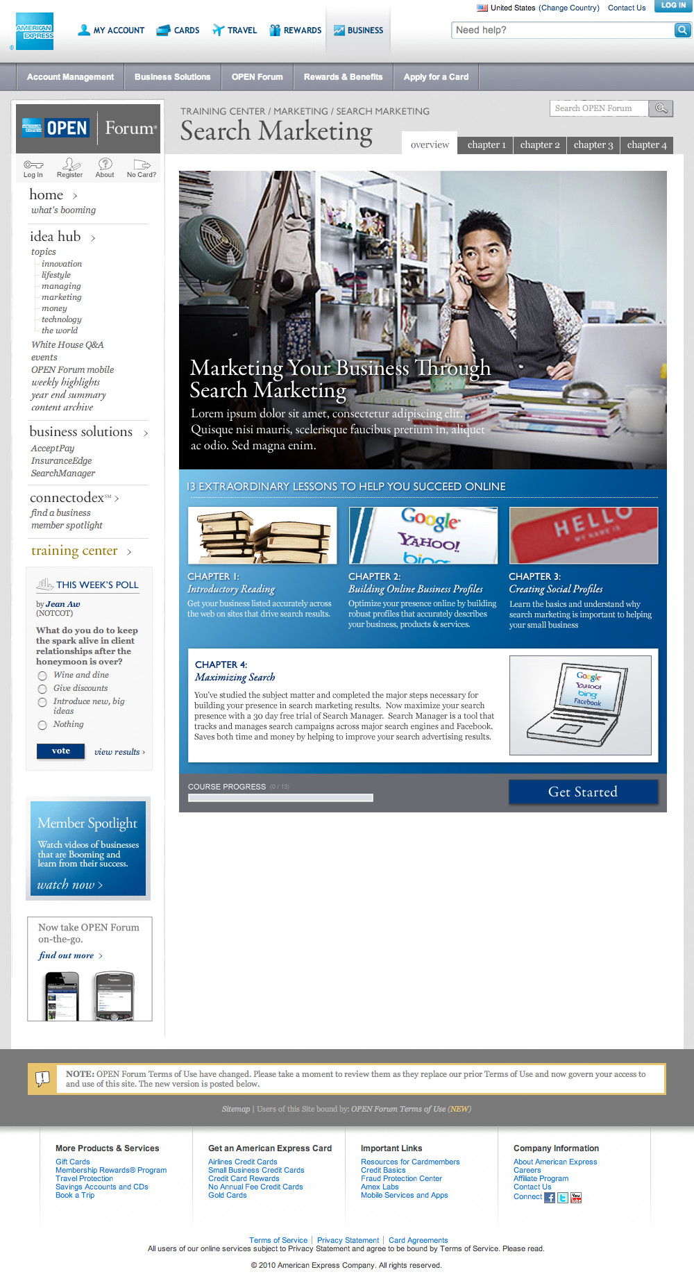
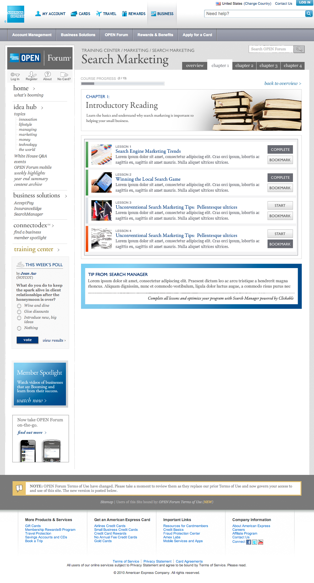
As a part of marketing effort geared toward small business owners, American Express provides content relating to various business management topics on a dedicated microsite. Bond Strategy and Influence was responsible for creating a section within the broader microsite dedicated to online marketing, advertising and customer engagement topics. I served as the visual designer for the project — responsible for extending the established brand guidelines across content landing and detail pages.

TOPIC LANDING PAGE

CHAPTER DETAIL
Reflection
Overall, ahead of the release of the iPad in 2012, the web overall exhibited a higher content density than it does today. This is reflected the tightness of the grid, the lack of white space in page composition. This also impacts the size of the UI controls, type, images and other page elements.
Structurally, the nesting of content sites within a broader parent architecture inhibited internal navigational controls.
A more contemporary take would revisit, how content is structured in having it as a site with a dedicated navigation and a more open layout — emphasizing greater readability.
«eyond that — revisiting this in 2018, I might explore simplifying the content structure and increasing visual hierarchy across headline styles. I would also explore a layout that allows for reduced line-lengths to make text more scanable.
Learn more about me.

